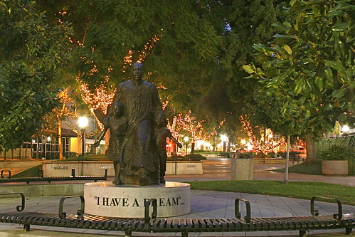
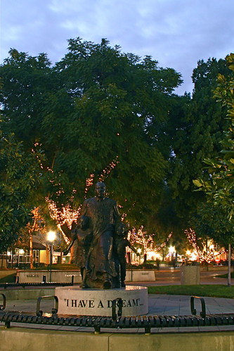
First off, I would like to have seen the Statue lit better. But since I was working off a tripod with no power, I could not add flashes. I am thinking that a reflector would be a nice addition to the gear. This was a 4 second exposure so flashes would have been tough to use and expose the background lights as well. I think that I will try this again with a flashlight to "paint" the statue. By the time I took the portrait shot, I needed an 8 second exposure to get the image that I wanted.
The real question is one of perspective. Sky or no Sky. It was overcast and the sun had just set, hence a 4 second exposure. The clouds offer a contrasty bigger feel with mood. A blue sky would offer a lighter mood, but the clouds offer a more solemn mood. I have put both up for your input, landscape with no clouds, or portrait with clouds.
As always, thanks for looking and the EXIF data for both pictures is below.
_____________________________
Landscape
| Camera: | Canon EOS Digital Rebel XTi |
| Exposure: | 4 sec (4) |
| Aperture: | f/8 |
| Focal Length: | 25 mm |
| ISO Speed: | 800 |
| Exposure Bias: | 0/3 EV |
Portrait
Camera: Canon EOS Digital Rebel XTi Exposure: 8 sec (8) Aperture: f/8 Focal Length: 18 mm ISO Speed: 400 Exposure Bias: 0/3 EV


Horizontal is much better as it draws the attention to the lights ing the background, which is just as interesting as the statue. Also it's closer in so you can see more detail.
ReplyDeleteEither way, you're a winner. Good stuff. Haver you ever tried doing any light graffitti? If you've never heard of it Google it. I want to try some.
From Dave, by the way.
ReplyDeleteReal funny that dave already made a comment. Apparently we are big fans. Typical with a vertical subject I would always say Vertical is the best option but in this pictures case I'ld have to agree with Dave. In the vertical version the trees seem to get most of the attention. The horizontal one makes the statue as the focal point more obvious and I also like the street lights.
ReplyDelete